Project

Designing a better banking
vebo app

Client Virgin Money
Agency Draw Creative
Year August 2017 - November 2018
Role Lead Product & Interaction Designer
01 —

Product overview

We live in a golden era for banking as a witness to the new financial revolution! In the last 5 years, the financial sector has become a playground for start-ups like Revolut, Monzo, Starling Bank, N26 and literally dozens of others.

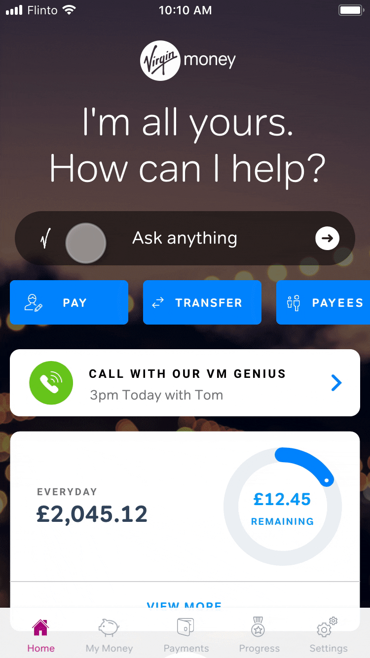
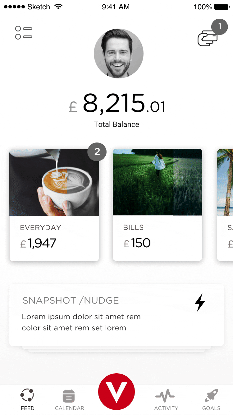
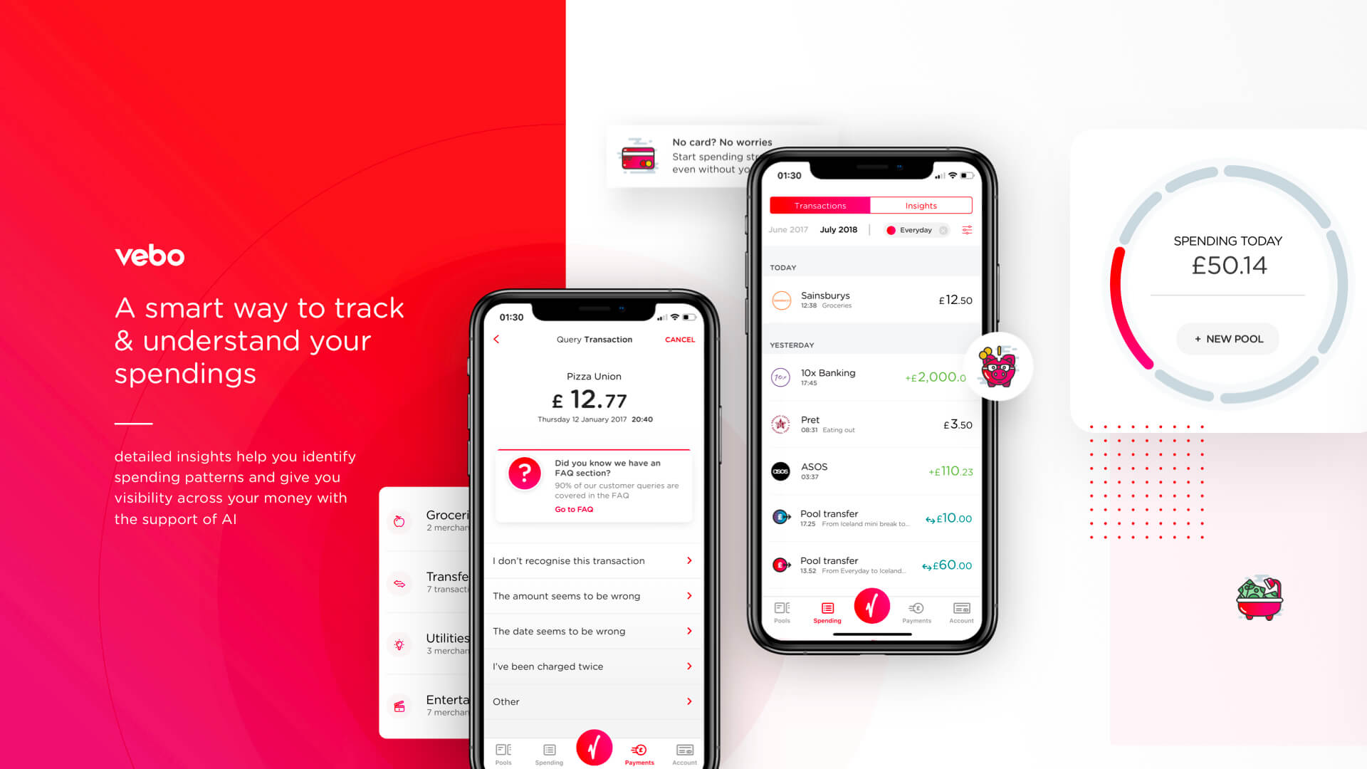
Virgin Money is more than just another old-fashioned bank. It’s a user-friendly financial institution that cares about customers and their needs, no matter how small they might be.

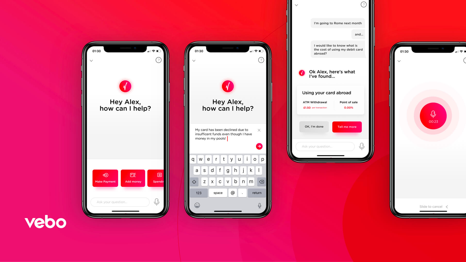
As a challenger bank in a client-bank relationship, Virgin Money needed a mobile app to differentiate it from the big leaders on the market like HSBC, Lloyds, Barclays or RBS. They wanted a product that would help their customers better understand and manage their money, instead of just showing the balance and allowing the user to transfer funds.

I need my bank not only to be a safe environment to store my money but to help me save it, get the maximum out of my money and to even help me earn more.

Virgin Money client
02 —

Virgin Money challenge

The proposition was to create an app whose core functionality is an artificially intelligent assistant;
the goal was to help the user understand money better: to learn how to save, to become wealthy.

So… we brought the vision to life…

VEBO became an AI mobile assistant helping people across the UK to better understand their finances and create a plan for saving money, to ultimately achieve financial freedom.

03 —

My role in the project

I joined the project when the team has already finished the research and problem discovery phase.

As a Lead Designer, I was responsible for scaling the Design and Interaction System across the entire app and creating a process for the product team.

I was a guardian of consistency in the app, I worked on creating a consistent product experience, first across the iOS, then Android; and I serviced the design and engineering teams to aid with speed and efficiency.

Fun fact:
During my 18 months journey with Virgin Money I prototyped over 600 different interactions, micro interactions and end-to-end solutions, from lo-fi to hi-fi.

We tested different concepts, styles and communication models.
Click to see details.

04 —

The design process

We worked in Agile methodology using “Spotify Framework” (6 product squads and 1 guild team).
I was a Lead Product & Interaction Desiger in the guild.

Every squat was responsible for a different business sector like core banking, money transfers, onboarding, app settings, personal assistant and credit cards. All of them were dependent on each other. This approach allowed us to better identify Information Architecture at the beginning of the project and gave us visibility of budget and timescale.
As a problem-solving process, to develop new solutions, we adapted and applied the Design Thinking Process, all packed within 2-week sprints, following the steps: empathize, define, ideate, prototype and test.

Since the very beginning, we worked against the clock to build early prototypes that we could launch and test. In this environment working collaboratively was the key to success.
The first 3 months was a concept phase to shape the functionality of the MVP.
Based on the research and analysis of customers’ data, we came up with 3 different proposals to the main challenge.

We tried to understand how people manage their money, if they were aware of any bad spending habits or credit patterns. We tried to understand what issues people have with money. We sought to understand why the poor are poor and the rich are wealthy, so we could help people who are in need, guiding them with AI support, instead of patronising them.
As a result of the team effort, we came up with 3 design concepts (based on the same user experience) that could serve the challenge.

05 —

My leader path

When I joined the team, the UX design of the app had already begun and was rapidly evolving and designs from the first sprints were falling out of step and basically were out of anyone’s control.
As the project was new, there was a lot of iteration and re-evaluation of UX patterns and then UI elements.
In the beginning, there was no central source of truth or any conceptual documentation for even simple elements like buttons, text styles, forms elements or components, and as a result no one could work efficiently and deliver consistent output, especially since the workflow came simultaneously from six independent squads.
The communication between design team members was chaotic, there was lots of frustration and blame in the air.
After the first couple of sprints, we knew that we had to find better solutions to our workflow and process.
Our approach was to keep a flat and open hierarchy in the team. People started being more helpful to each other, to listen and be open to new possibilities and challenges. All the problems that appeared out of the blue weren’t game changers anymore, but just small blockers, that we were able to solve on the fly together.

06 —

Mindset change

The whole team had to change their mindset. Instead of being responsible only for “my” own bit in a sprint, they became a team with a variety of skillsets, happy to share and happy to participate in peer review sessions. Every small success seemed to pump new air into the project at every sprint.
We used a ‘sprint 0’ to try to make sure we had a design in place before features got into development but quick amendments and fixes were often needed, and it stopped being a blocker anymore.

Our approach to every challenge was simple — Evolution not Revolution of the app, which was hard to implement as we were all designers who aimed for pixel perfection and wanted to improve everything and start over again and again, even forgetting about time and budget.

07 —

Challenges

The biggest challenge for me as a leader was to keep everybody up to date with all information, updates and decisions we made in guild; to train people to use the same components and interactions patterns rather than rediscover new patterns every sprint, and the last, but in my opinion the most important, was to make sure everybody understood the whole design process, workflow and their role in it.

To achieve anything we needed to work like a well-oiled machine, everybody had to understand his importance in the project. We were a team of equal individuals, and this approach allowed us to eliminate egos and have each other's backs.

The best and the most efficient element in our design process were weekly 1 on 1 peer review and group review sessions, presentation of new and revision of old UX/UI patterns.

08 —

Design System

We designed and built a centralized source of truth —  cloud base Design System.

We used Atomic Design approach and started from covering the basics design guidelines such as typography, layer styles (Fills, Strokes, Shadow), iconography and resources, then we concentrated on atoms, molecules, organisms, templates, pages/views, and finally design tokens.

Our aim was to cover the most important elements from the functionality point of view for each squad. Our delivery of new components was fully aligned with the need of squads and the development team.

The very first, fully functional version of the app (VEBO v0.5) allowed us to cover user flows such us: pay someone or pay a bill, transfer the money, see the balance account and all the transactions in real-time. Next iterations of the MVP (e.i.: VEBO v0.7) covered more features like managing the personal settings, card settings like freeze, see PIN and so on…

Working within 2-week sprints, we were able to build up new functionality step by step and improve the current app, learning from our mistakes, wrong assumptions, and basically trying to solve the issues our users have.

09 —

Summary

We were not the first on the market with a revolutionary bank vision, so we couldn’t ignore competitors who had already covered this ground. We learnt from their moves; this helped us to evolve our market hypothesis, and prioritized our product development with the right data, based on pieces of information that we had, looking at our competitors to understand the customers better.

10 —

What we achieved?

After 3 months of conception phase, working closely with stakeholders, we came up with the best possible solution for our users, based on time and our skills, that also suited Virgin Money as a brand and system of its beliefs.

Any banking app is a really complex application, so it was logical to release the early version of basic functionality as soon as possible. We work on the product in quarters that allowed us to deliver the very first MVP 4 months after starting the development. We learnt on the fly, taking every problem as a possibility to gain a new perspective. Our first solutions weren’t the best but gave us an opportunity to learn and to develop better solutions later.

We adopted new approaches:
Done and delivered is better than perfect
and
Evolution instead of Revolution of the product.

We automated the process of adding functionality to the app by solving users’ issues based on user journeys and internal tests, rather than just adding user stories from backlog. It allowed us to quickly iterate the current app, not just redesign and rewrite the whole app from scratch every time we pivoted… and yes, we pivoted 3 times!

Designing and building a stable and centralized source of truth, which was Design System, allowed us to iterate faster and basically design the app on the fly at the end of the project.

I left the project when Virgin Money was taken over by the Clydesdale and Yorkshire Bank Group (CYBG). After 18 months spent in the project, we handed over the fully functional Design System and a stable version of the App (VEBO v2.0)

The final product after some brand changes finally went live in December 2019
The same Design System was implemented by the 3rd party software house and used to build the other product - Virgin Money Credit Card App.